Code
The bias and variance of moving from sample to population.
Generalization is the process of using a subset of information to draw conclusions about some broader set or phenomenon. It is powerful - it allows us to draw conclusions about things we have not observed - but it is tricky to do well. In these notes, you will learn the sources of error that can creep in when making a generalization.
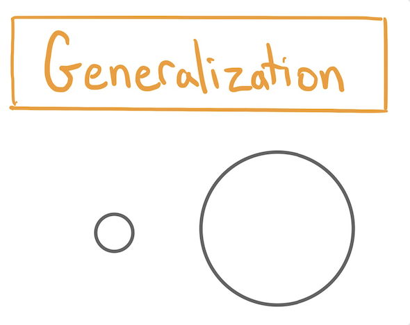
There are four terms that you will see come up again and again as we discuss generalization. They are familiar terms that have tightly coupled meanings, so we present them together.
To see how these terms interrelate and to introduce the sources of error that can creep in while generalizing from a sample to a population, let’s look a scenario.
On the first day of class, the professor strides into Pimentel Hall to present a lecture to a new crop of students. If you have not yet had the pleasure of having a class in Pimentel, it looks like this.

Pimentel1 is the second largest lecture hall at Cal with exactly 527 seats. On this first day of class, the room is packed and all 527 of the students registered for Stat 20 are in the hall.
1 Photo of Pimentel Hall by flickr user TheRealMichaelMoore.
Eager to ensure that the lecture is calibrated to the interest and experience of the students, the professor seeks to learn how many years they have been at Cal. The professor calls on a student sitting in the middle of the front row and asks, “What year are you at Cal?” The student replies, “sophomore”, so the professor write 2 on the board. The professor proceeds to repeat this question to all of the students sitting in the 18 seats at the front row of Pimentel. By the end, there is a data frame on the board with one column and 18 rows, the first three of which read
| Year |
|---|
| 2 |
| 1 |
| 1 |
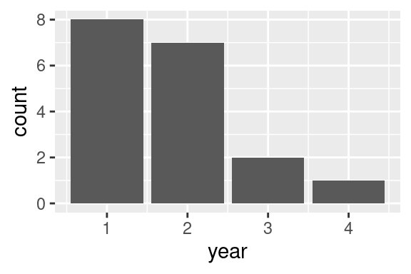
Ever the statistician, the professor then visualizes the distribution of data by sketching on the board a bar chart and jots down the sample mean, which is 1.77.

How good of an answer is 1.77 to the professors question of, “What year are my students?”
In this setting, the population is the set of all \(N = 527\) students in Pimentel. That is the set of units (students) that the professor seeks to understand and from which the sample is drawn. The sample is the subset of \(n = 18\) students who were sitting in the front row and who were asked their year at Cal. The sample mean, \(\bar{x} = 1.77\), is an example of a statistic. Other statistics that could be calculated from the sample include the median (2) and the mode (1). These statistics be used to estimate their analogs in the population, such as the population mean, \(\mu\). The value of \(\mu\) is what the professor seeks to learn, but at this point is still unknown.
Using this terminology, we can ask the question again: how good of an estimate of the mean year of the entire class is the sample mean, 1.77? How much error did we incur when generalizing and where did that error come from?
To understand the forms that estimation error can take, consider the analogy of darts thrown at a dart board. The center of the dart board represents the parameter that we are trying to hit and each dart that we throw represents a statistic calculated from a sample. There are two ways in which a dart throw can miss the bullseye. One way is that we could systematically tend to throw above and to the left of the bullseye. This form of error is called bias. Another way that our dart-throwing could miss the bullseye is if we are an erratic thrower and one throw tends to be very different from this next. This form of error is called variation or variability.
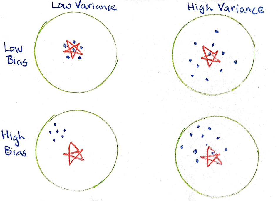
If a sample is representative of the population, there is no bias present. That is represented by the top row of bullseyes.
Statistical bias comes in many forms. Here we describe two of the most important types.
As an example, a convenience sample chooses the units that are most easily available. Problems can arise when those who are easy to reach differ in important ways from those harder to reach. Another example of selection bias can happen with observational studies and experiments. These studies often rely on volunteers (people who choose to participate), and this self-selection has the potential for bias if the volunteers differ from the target population in important ways.
For example, low humidity can systematically give us incorrectly high measurements for air pollution. In addition, measurement devices can become unstable and drift over time and so produce systematic errors. In surveys, measurement bias can arise when questions are confusingly worded or leading, or when respondents may not be comfortable answering honestly.
All of these types of bias can lead to situations where the data are not centered on the unknown targeted value. A common method to address selection bias is to draw a simple random sample, where each unit from the population is equally likely to be drawn. A pilot survey can improve question wording and so reduce measurement bias. In the lab sciences, procedures to calibrate instruments and protocols to take measurements in random order can reduce measurement bias. Non-response bias can be addressed by providing incentives for participation.
Bias does not need to be avoided under all circumstances. If an instrument is highly precise (low variance) and has a small bias, then that instrument might be preferable to another that has high variance and little to no bias. Biased studies can be useful to pilot a survey instrument or to capture useful information for the design of a larger study.
The method used by the professor likely suffers from statistical bias. The units that were drawn into the sample (the 18 students in the front row who were called on) constitute a convenience sample: they were sampled because they were easy to sample. That is not necessarily a problem, but there is good reason to think that students of all years are not equally likely to sit in the front row. First year students, bright-eyed and bushy-tailed with enthusiasm, will be more likely to sit in the front row. If that is true, the professor incurred selection bias that will lead to an estimate of the population mean that is too low.
What about measurement bias? In this case, the process of measuring a student’s year involves the act of asking them a question, hearing their answer, and writing it on the board. How could this be systematically in error? One way would be if first year students occasionally lie about their year when asked, for fear of being thought of as an over-eager over-achiever. If this were true, then lots of the 2s that we recorded were in fact 1s, and the estimate of 1.77 would be too high.
What about non-response bias? This is likely not a problem in this setting. While it can be easy to ignore a question that appears in a survey that you get via email, it is much more difficult to dodge a question asked of you directly during class.
Whether or not bias is present, data typically also exhibit variation.
There is some amount of randomness that plays into which units made their way into the professor’s sample of size 18. At the start of a semester, students tend to sit in a different seat each day they come to class. Even in a world were all students are equally likely to sit in the first row (therefore there is no bias), our sample of 1.77 might be too low because that day an unusally high number of first year students happened to sit in the front row, purely due to chance. The next day, perhaps an unually high number of juniors would sit in the front row and the estimate would leap up to, say, 2.7. This is sampling variability.
Variability in measurement here would refer to a process by which the recorded year for a student would differ from one measurement to the next. Imagine a student who sits in the front row on the first day and is recorded as a two That same student sits in the front row on the 10th day and is recorded as a one. It’s hard to imagine there being much measurement variability here but you can imagine a very absent-minded professor who, upon hearing the year, will sometimes immediately forget what had been said and will record a random year.
One of the key concepts in understanding estimation errors when using statistics is to understand the shape of the sampling distribution of that statistic.
The distribution of a statistic upon repeated sampling.
Even though this distribution has an innocuous name, something big is happening with this definition. No longer are we considering the (usually unknowable) distribution of the population or the observed distribution of the data (an empirical distribution). The sampling distribution is a distribution of a statistic, illustrating the different values that it could take, along with the probability of getting each of those values in a given sample.
Usually the sampling distribution is a hypothetical thing: what would our statistic have looked like if we had taken a different sample of data? We can make it concrete by working in a setting where we can actually do just that.
To understand the role that bias and variation play in estimates, we will for the moment assume that we have access to the entire population. This is almost never the case: if we had the population, we wouldn’t need to bother with estimating it from a sample! It is a very useful thought experiment, however. It allows us to see the different ways that samples and statistics can be drawn under different scenarios.
For this thought-experiment, we will will be drawing from a population that has 527 observations / rows, one for every student in Pimentel, with a population distribution of year that looks like this.
pop_eager <- data.frame(year = factor(rep(c(1, 2, 3, 4),
                                   times = c(245, 210, 47, 25))),
                        eagerness = rep(c(10, 6, 3, 1),
                                        times = c(245, 210, 47, 25)))
set.seed(34)
pop_eager <- pop_eager %>%
  slice_sample(n = nrow(pop_eager)) # shuffle the rows to make them look natural
pop_eager %>%
  ggplot(aes(x = year)) +
  geom_bar(fill = "purple") +
  labs(title = "Population Distribution")
In the data collection scheme used by the professor, the students who happened to be sitting in the 18 seats at the front of the class are the ones who will make it into the sample. As discussed above, it is likely that this process will result in selection bias since first year students tend to be more eager and eager students tend to sit at the font of the class.
We can do our best to envision what this selection bias would look like by selecting each student out of the population with a probability that is proportional to their eagerness. Let’s say first year students have an eagerness score of 10 out of 10, sophomores have a 6, juniors a 3, and seniors a 1. Here are the first 5 rows of the population data frame with the eagerness scores right next to the year of the student.
slice(pop_eager, 1, 2, 3, 4, 5) year eagerness
1 3 3
2 2 6
3 2 6
4 1 10
5 2 6When simulating the process that the professor used to draw 18 students, we can select the first student, a junior, with probability of 3 divided by the total eagerness of all of the students (the sum of the eagerness column), which is 4900. The probability of that student (or any junior) is \(3/4900 = 0.0006\). That is small, but that’s not surprising: there are 527 students in the class, so the probability of selecting just one of them should be small.
The probability of selecting the fourth student from the population data frame above, a first year, can be calculated as \(10/4900 = .002\). That’s also small, but it is 3.33 (10/3) times the chance of selecting a junior. In this setting, we’re using eagerness as a sampling weight to determine the relative probability of selecting more eager students into the sample.
Let’s now simulate the process of drawing 18 rows out of the data frame of 527 rows, where each row is being selected with a probability proportional to it’s eagerness. The three plots along the top row of the plot below illustrate what the empirical distribution of three samples might look like. They help us envision what the professor’s plot on the board would look like on three different days where the 18 students in the front row were called on, and in each of those days, it is the first year students who are most likely to end up the front row.
library(infer)
samp_1 <- pop_eager %>%
  slice_sample(n = 18,
                   replace = FALSE,
                   weight_by = eagerness)

many_samps <- samp_1 %>%
  mutate(replicate = 1)

set.seed(40211)

for (i in 2:500) {
  many_samps <- pop_eager %>%
    slice_sample(n = 18,
                 replace = FALSE,
                 weight_by = eagerness) %>%
    mutate(replicate = i ) %>%
    bind_rows(many_samps)
}

p1 <- many_samps %>%
  filter(replicate == 1) %>%
  ggplot(aes(x = year)) +
  geom_bar() +
  labs(title = "Sample 1")

p2 <- many_samps %>%
  filter(replicate == 2) %>%
  ggplot(aes(x = year)) +
  geom_bar() +
  labs(title = "Sample 2")

p3 <- many_samps %>%
  filter(replicate == 3) %>%
  ggplot(aes(x = year)) +
  geom_bar() +
  labs(title = "Sample 3")

many_xbars <- many_samps %>%
  group_by(replicate) %>%
  summarize(xbar = mean(as.numeric(year)))

p4 <- many_xbars %>%
  ggplot(aes(x = xbar)) +
  geom_bar(fill = "purple") +
  lims(x = c(0, 4)) +
  labs(title = "Sampling Distribution")

library(patchwork)

(p1 + p2 + p3) / p4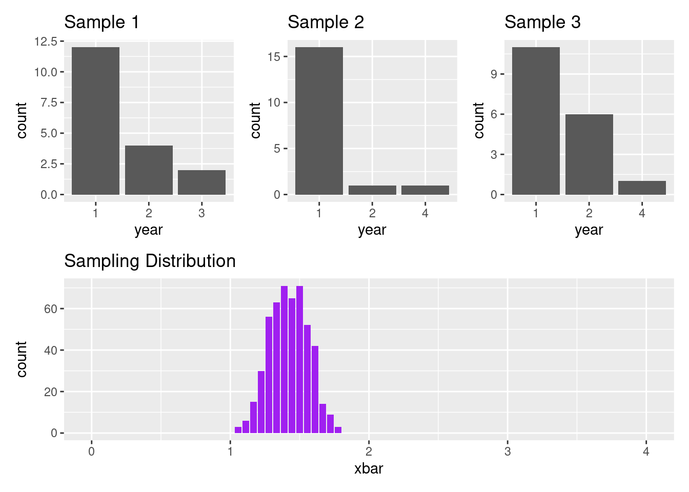
As you look from Sample 1 to Sample 3, you notice that the distribution of year varies from sample to sample. This is sampling variability. If you compare these plots to the population distribution above, you’ll find these three samples on balance seem to systematically have more first year students that you might expect. This is an effect of selection bias.
Both of these notions are captured in the sampling distribution. To understand the notion of a sampling distribution, imagine that you:
This distribution is shown in the bottom row. We can see that in this scenario, it’s possible to get \(\bar{x}\)s that are as low as around 1 and as high as around 1.8. The \(\bar{x}\) that we would expect from this process is around 1.4.
In these notes we laid out a common goal of making generalizations: estimating the value of population parameters using statistics calculated from samples. The process of generalization is subject to several sources of error that are lumped into statistical bias and variation. Three of the central forms of statistical bias are selection bias, measurement bias, and non-response bias. Two common forms of variation are sampling variability and measurement variability. With these notions of error in mind, we learned about the sampling distribution, the distribution of statistics that we would observe if we were to sample from the sample population many times and compute many statistics.
The sampling distribution is the central concept in making generalizations so we will revisit it throughout the coming weeks.